This comprehensive guide provides a detailed walkthrough of the Contineo UI Builder platform, a powerful visual development tool designed for creating sophisticated web interfaces with minimal coding requirements. The document covers everything from initial setup to advanced features, including:
Platform Overview: Introduction to the UI Builder's capabilities and core features.
Step-by-Step Setup: Detailed instructions for accessing and configuring the Widget Manager Interface.
Navigation: Complete breakdown of the UI Builder's interface components and functionality.
Component Management: Guide to adding, configuring, and customizing various UI components.
Data Integration: Instructions for setting up data schemas and implementing data binding.
Event Handling: Detailed coverage of event management and controller implementation.
Best Practices: Essential tips for organization, performance, and maintenance.
Target Audience: This guide is suitable for both beginners and experienced developers looking to leverage the Contineo UI Builder for efficient web interface development.
Version Compatibility: This documentation is applicable to the current version of the Contineo UI Builder platform. The Contineo UI Builder is a visual development platform that enables you to create sophisticated web interfaces without extensive coding. This guide walks you through from basic setup to advanced implementations.
Introduction
The Contineo UI Builder is a visual development platform that enables you to create sophisticated web interfaces without extensive coding. This guide will walk you through from basic setup to advanced implementations.
Step 1: Accessing the Widget Manager
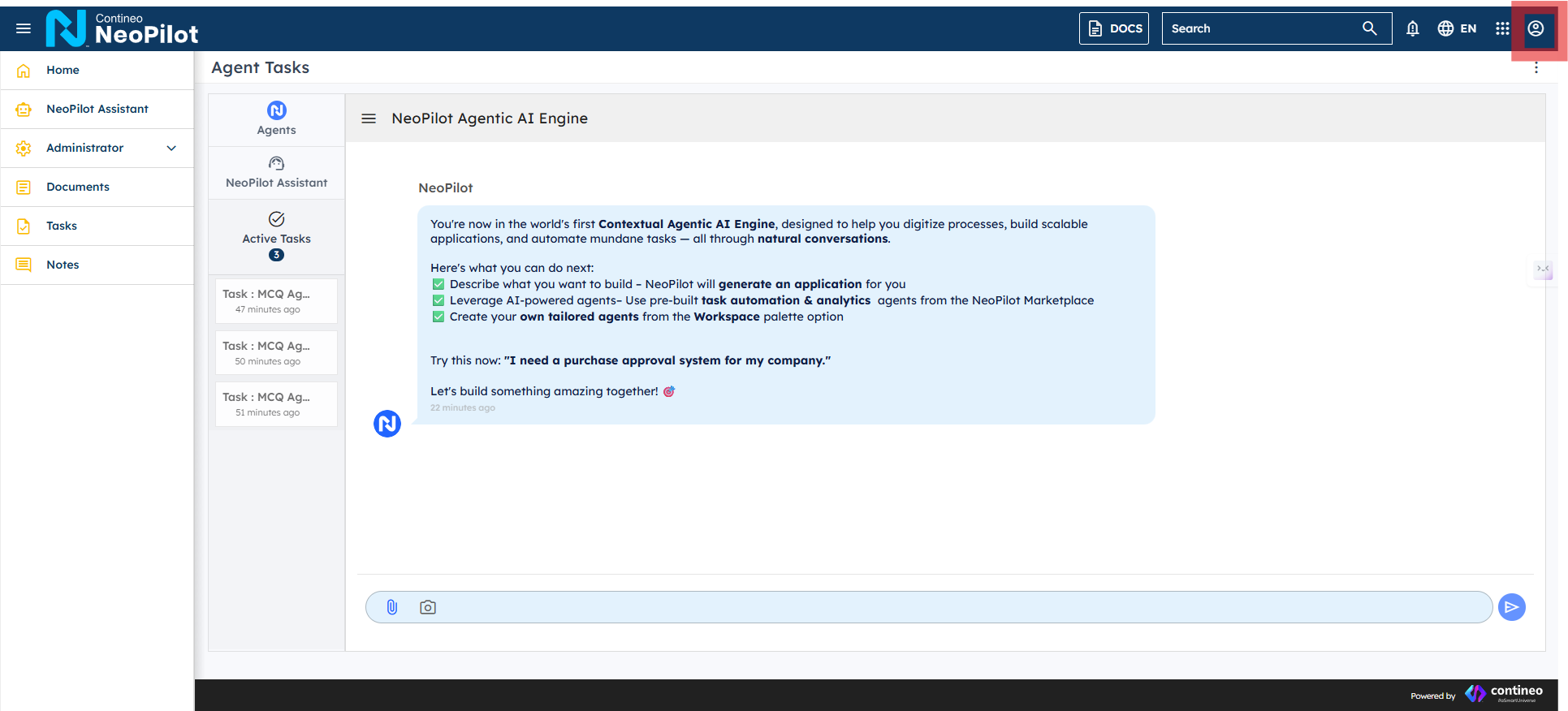
Login to Neopilot.
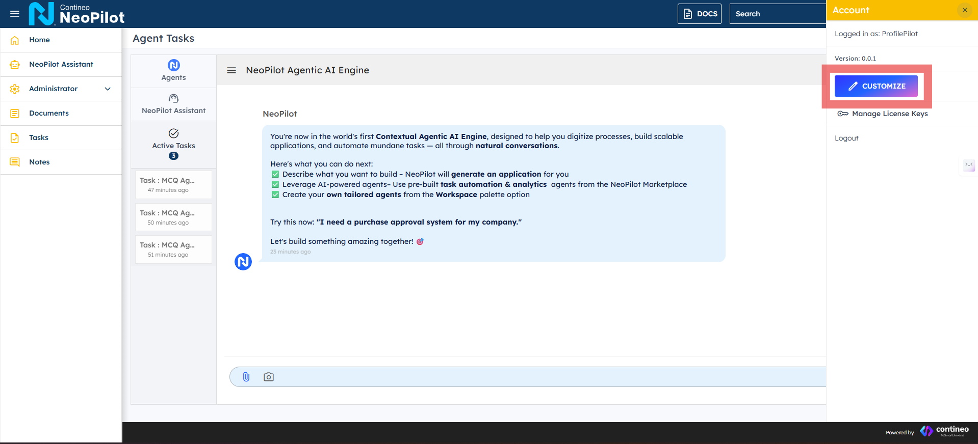
Click on the accounts icon at the right.
Click CUSTOMIZE.
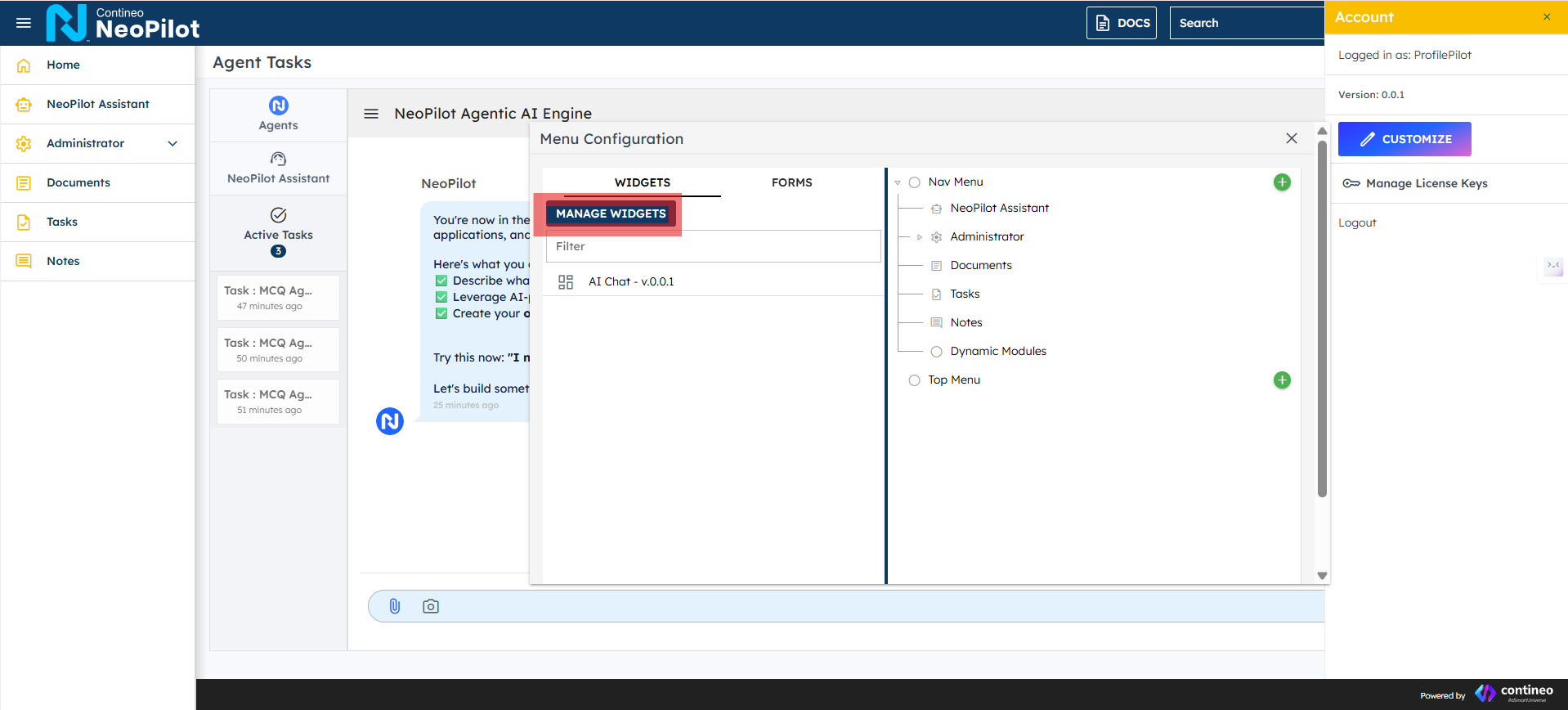
Click MANAGE WIDGETS.
Click '+' to add the new widget.
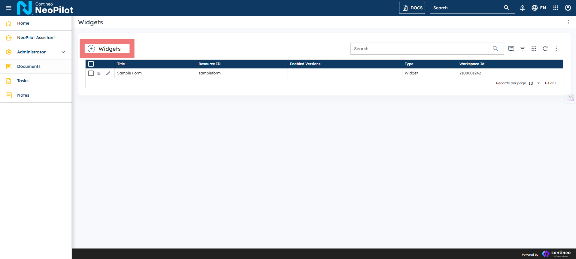
The Contineo UI Builder interface provides a comprehensive workspace for managing and creating web interfaces. The main screen consists of several key areas:
Navigation: The top bar contains quick access to various test types and widgets, along with essential tools like search and user settings.
Widget Management: The central area displays a well-organized table of widgets where you can:
View all available widgets
Check their resource IDs
Monitor enabled versions
Identify widget types
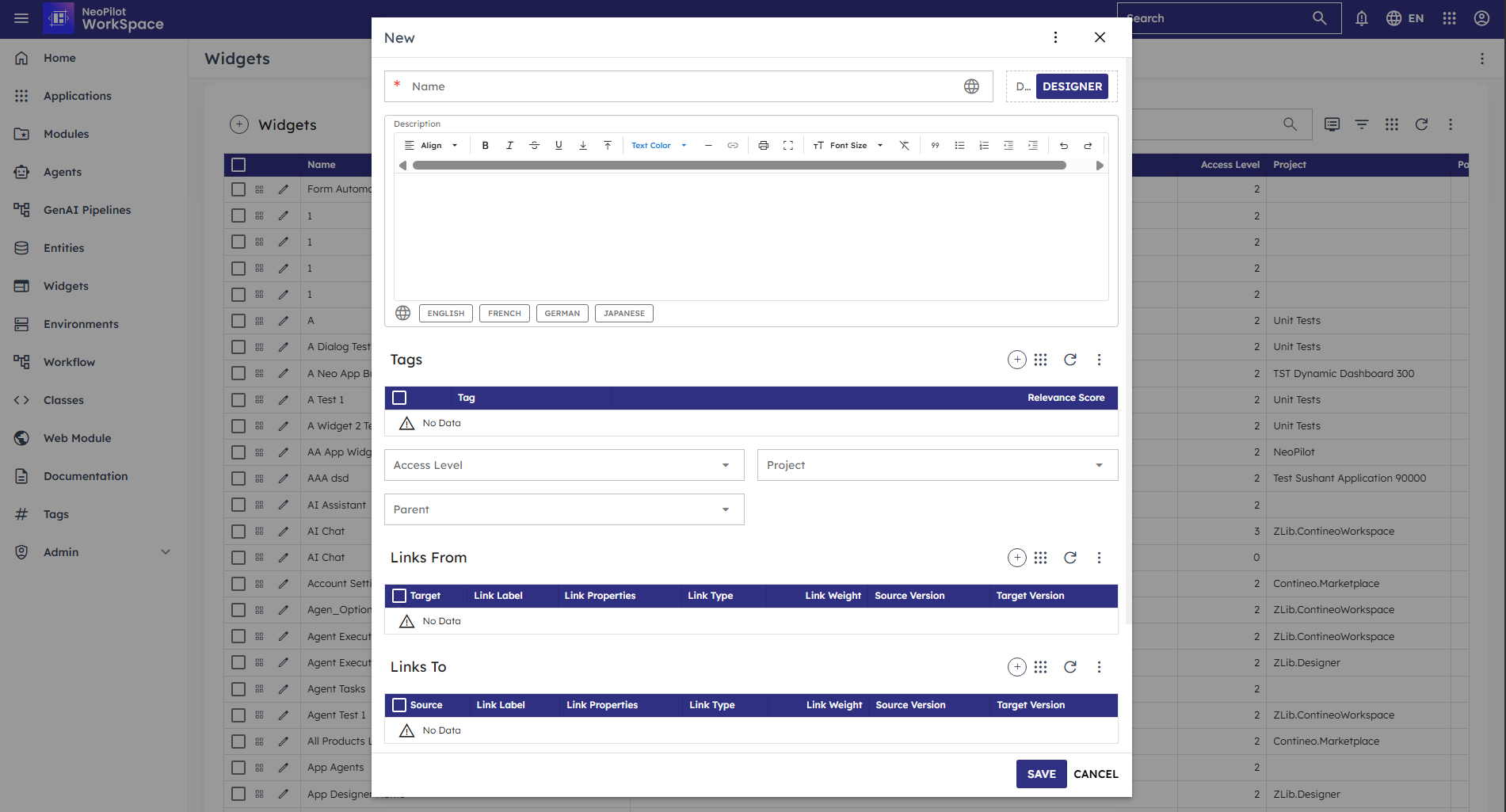
Step 2: Creating a New Widget
Click the "+" button next to "Widgets"
Fill in the required details:
Title: Enter a descriptive name for your widget
Resource ID: Provide a unique identifier (lowercase, no spaces)
Enabled Versions: Click OPENDESIGNER to enable design capabilities
Use the SAVE or CANCEL buttons at the bottom to complete or abort the creation.
Step 3: Open Designer

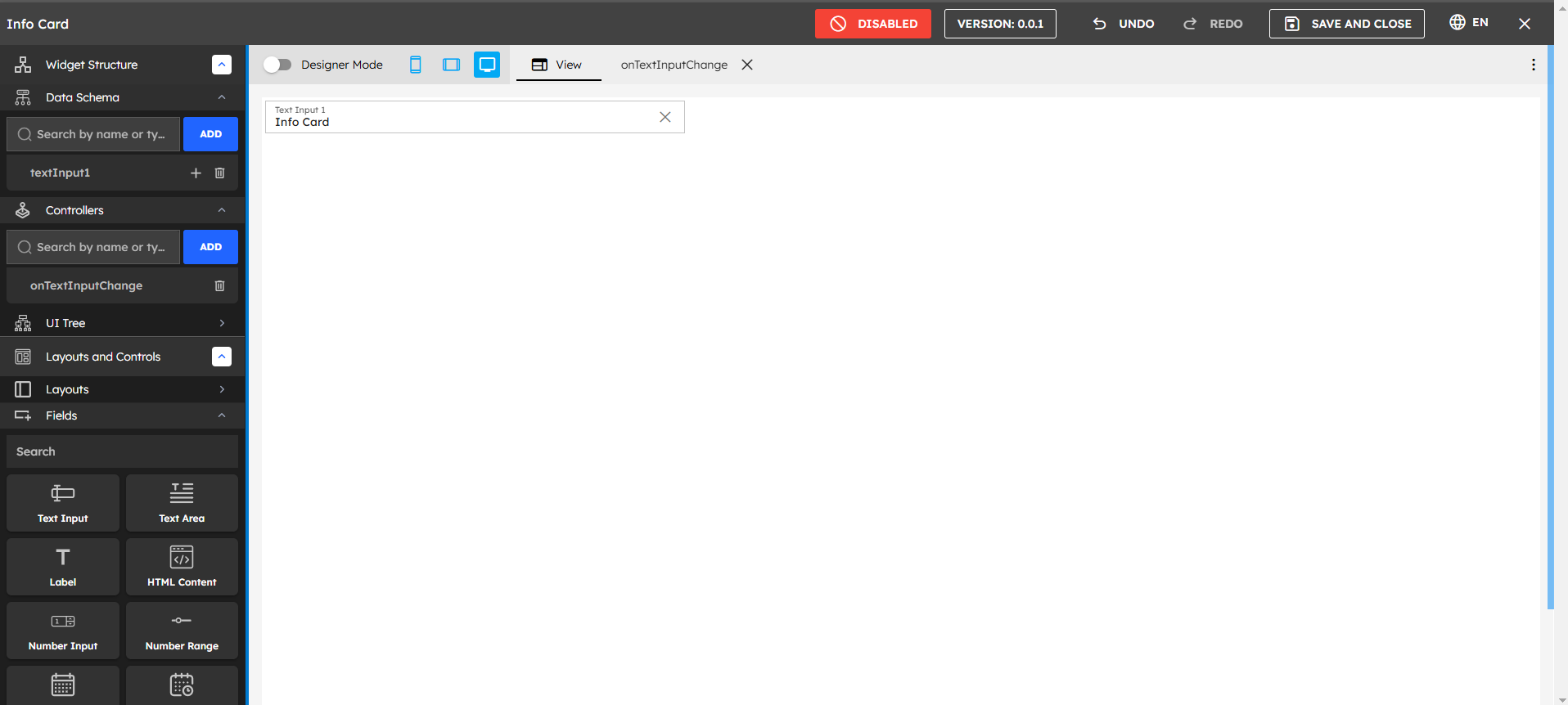
Top Toolbar Components
Mode Controls
Designer Mode Toggle:
When Enabled:
Allows you to add and customize components
Gives access to the design toolbox
Lets you modify layouts and styling
When Disabled:
Shows a live preview of your widget
Lets you test interactions and functionality
Displays the widget exactly as end-users will see it
View Options:
Phone icon: Mobile view
Tablet icon: Tablet view
Desktop icon: Desktop view
Step 4: Understanding the Interface
When working with the UI Builder, first select your desired layout from the options presented in the center panel. Click on the layout that best suits your needs to apply it as the foundation for your widget design.
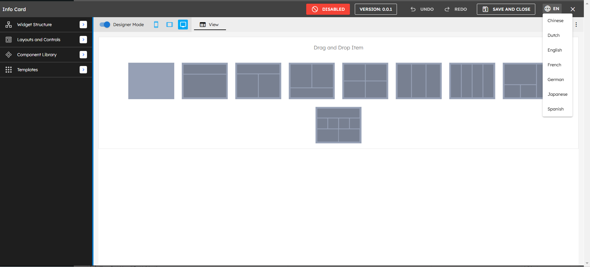
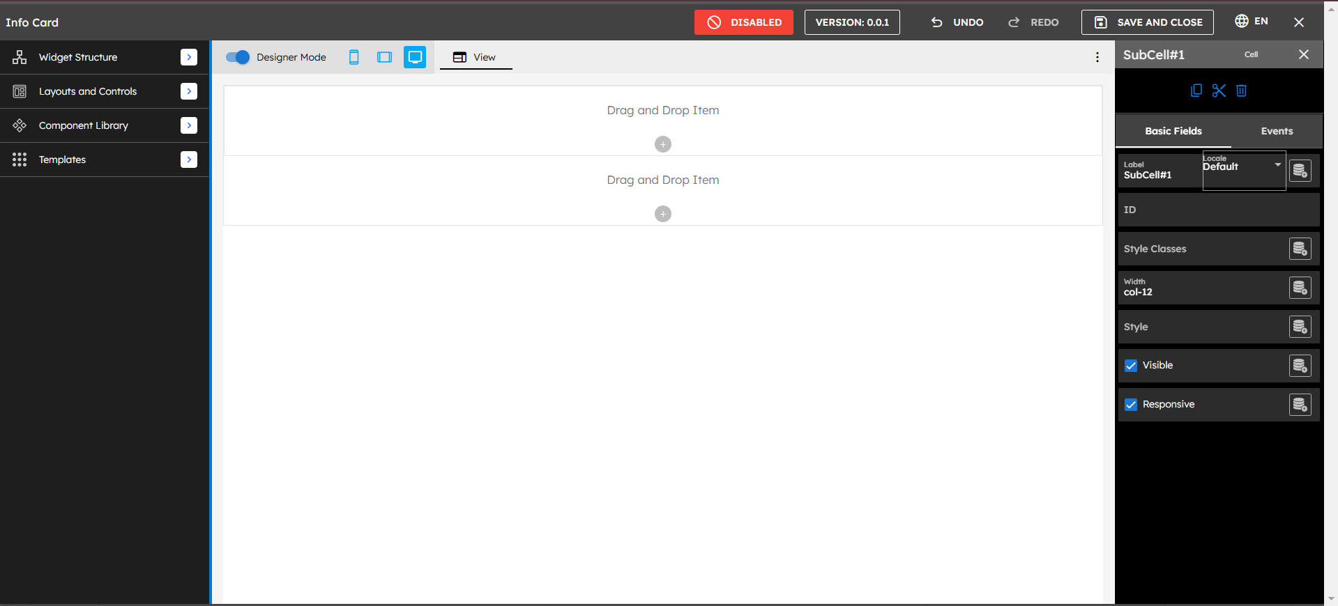
The UI Builder interface consists of three main panels:
Left Panel
Widget Structure: Hierarchy of components
Data Schema: Data definition section
Controllers: Event and logic handlers
Layouts and Controls: Available components
Component Library: Reusable components
Templates: Pre-built layouts
Center Panel
Design canvas with drag-and-drop zones
Multiple layout options shown as thumbnails
"Drag and Drop Item" placeholders
Right Panel
Basic Fields
Events
Style settings
Configuration options
Step 5: Adding Components
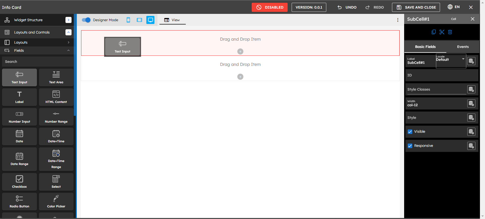
Expand "Layouts and Controls" in the left panel
Choose from available components:
Text Input
Text Area
Label
HTML Content
Number Input
Date
Date/Time
Drag desired component onto the canvas
Position it in the desired location
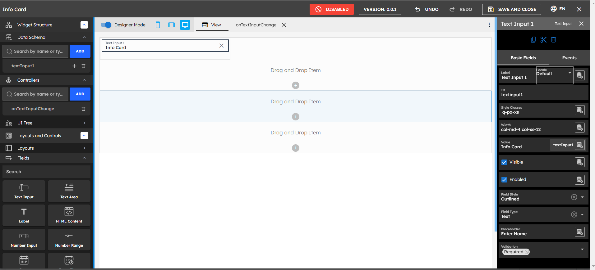
Step 6: Configuring Components
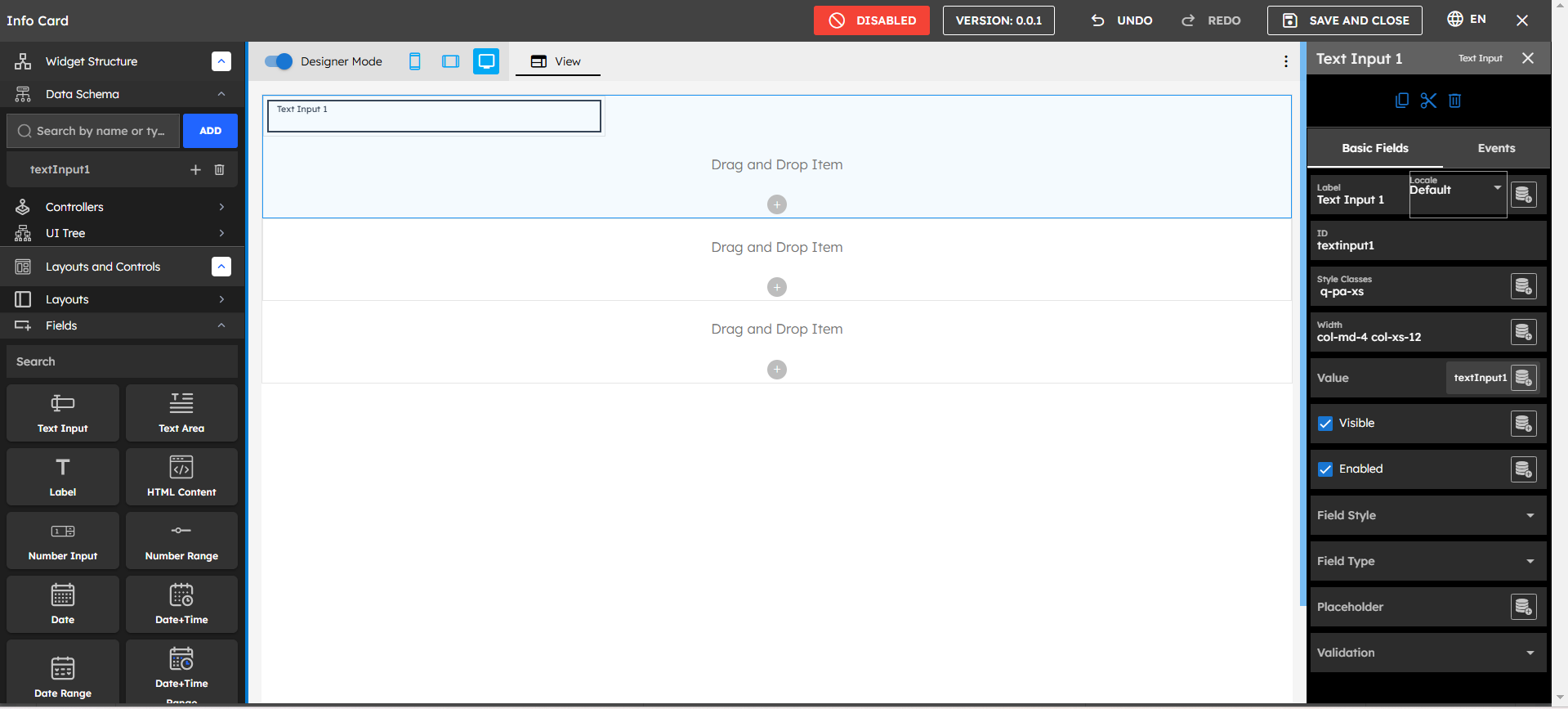
After placing a component:
Select the component on the canvas
Use the right panel to configure:
Label
ID
Style Classes
Width
Value
Visibility
Enabled state
Field Style
Validation rules
Step 7: Setting Up Data Schema

Create Data Schema
Navigate to Widget Structure
Go to Data Schema
Click Add Data
Choose data type (Text, Number, Object, Array, DataList)
Assign meaningful names
Step 8: Creating Controllers
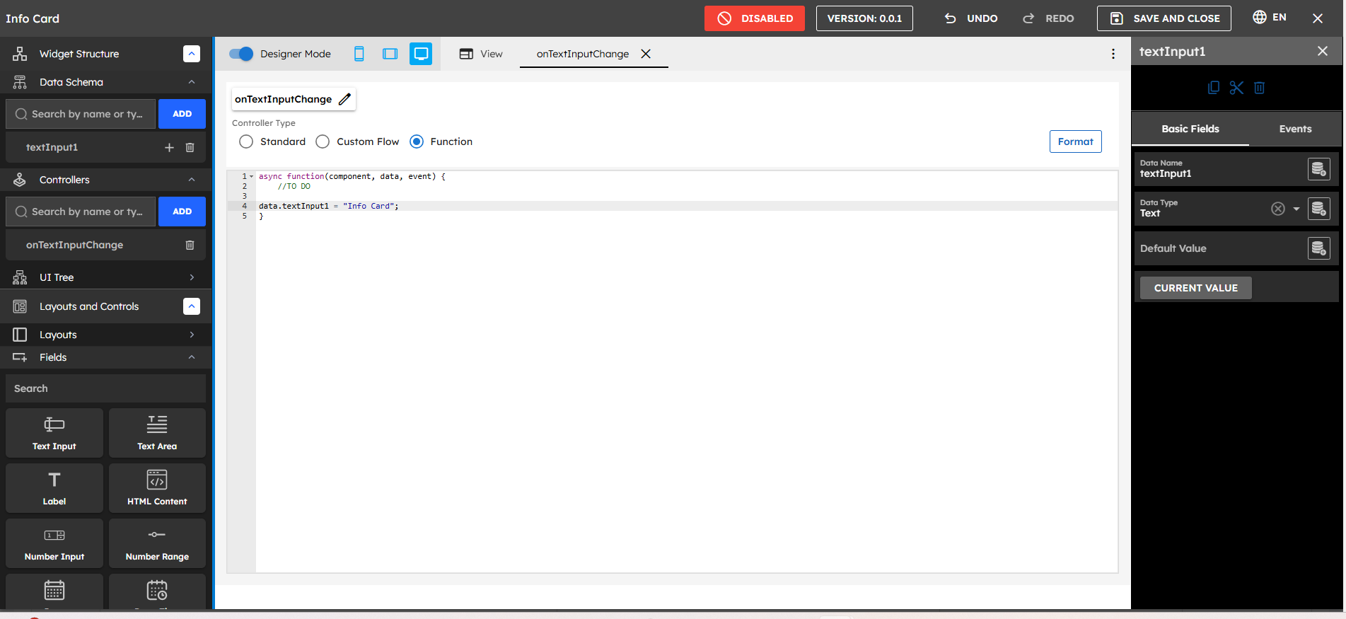
Navigate to Controllers section.
Click ADD.
Choose controller type:
Standard
Custom Flow
Function
Write your controller logic
Step 9: Event Handling
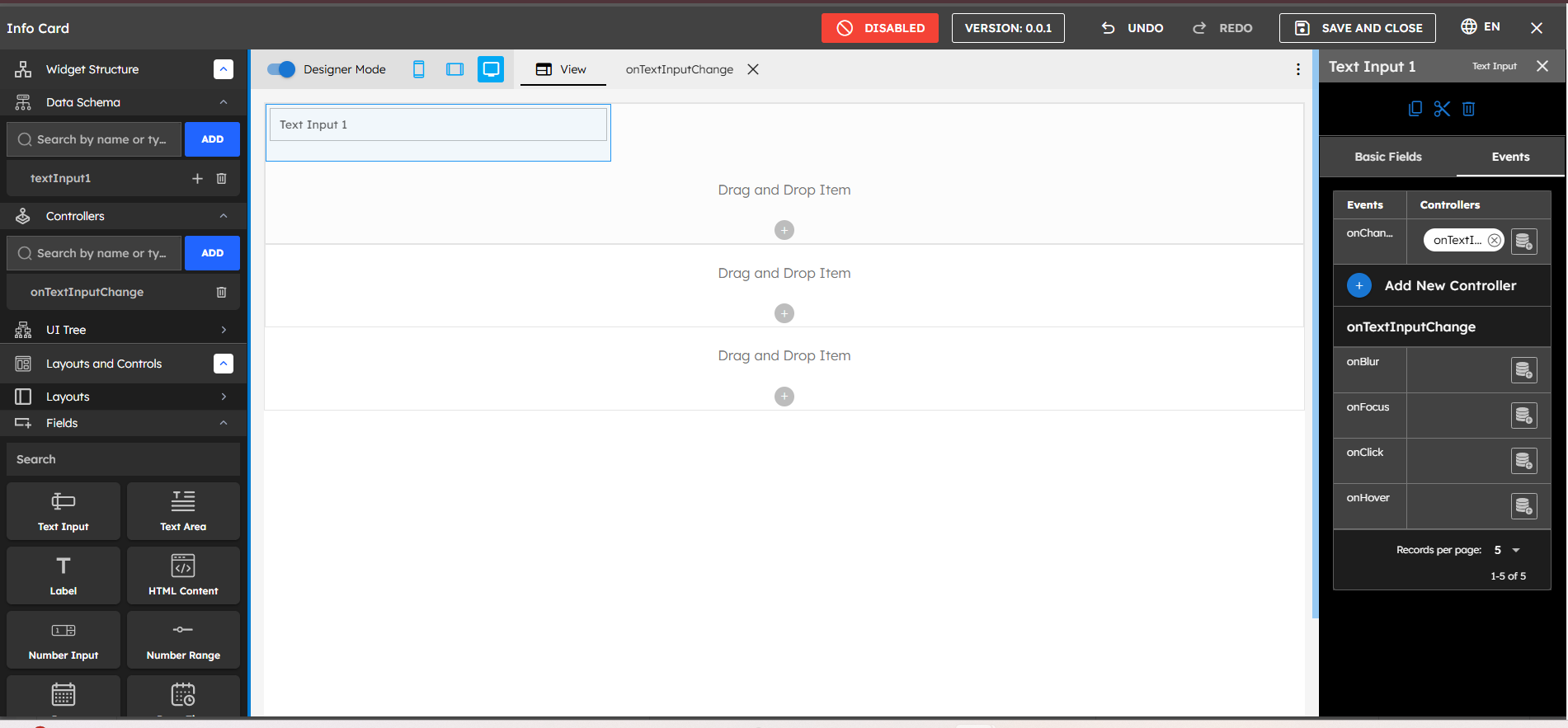
In the right panel's Events tab:
Select the component
Choose from available events:
onChange
onBlur
onFocus
onClick
onHover
Attach with controller functions to the particular event
Step 10: Data Binding
The UI Builder implements a sophisticated data binding system:
Widget Structure: Access through the Widget Structure section
Data Schema: Define your data structure
Binding Process:Connect to Components
Select your component
Look for data mapping icons
Click to view available data
Select desired data field
Best Practices and Tips
Organization
Use consistent naming
Group related components
Document complex logic
Maintain clean structure
Performance
Optimize data bindings
Minimize controller logic
Use efficient events
Cache when possible
Maintenance
Regular testing
Code documentation
Version control
Backup important widgets
Import & Export