Adding Fields In Widget
Learn how to add different type of fields in widget.
You can add different type of fields in your widget.
Once you create a custom field for a content type, the field is accessible by using the model of the content widget. Following types of field are present.
Label, Text, Text Area, Date, Date+Time, Integer, Decimal, Select, Radio, Multiselect, Checkbox, File, Image, Date Range, Date+Time Range, Integer Range, Decimal Range.
Steps:
Create a new widget.
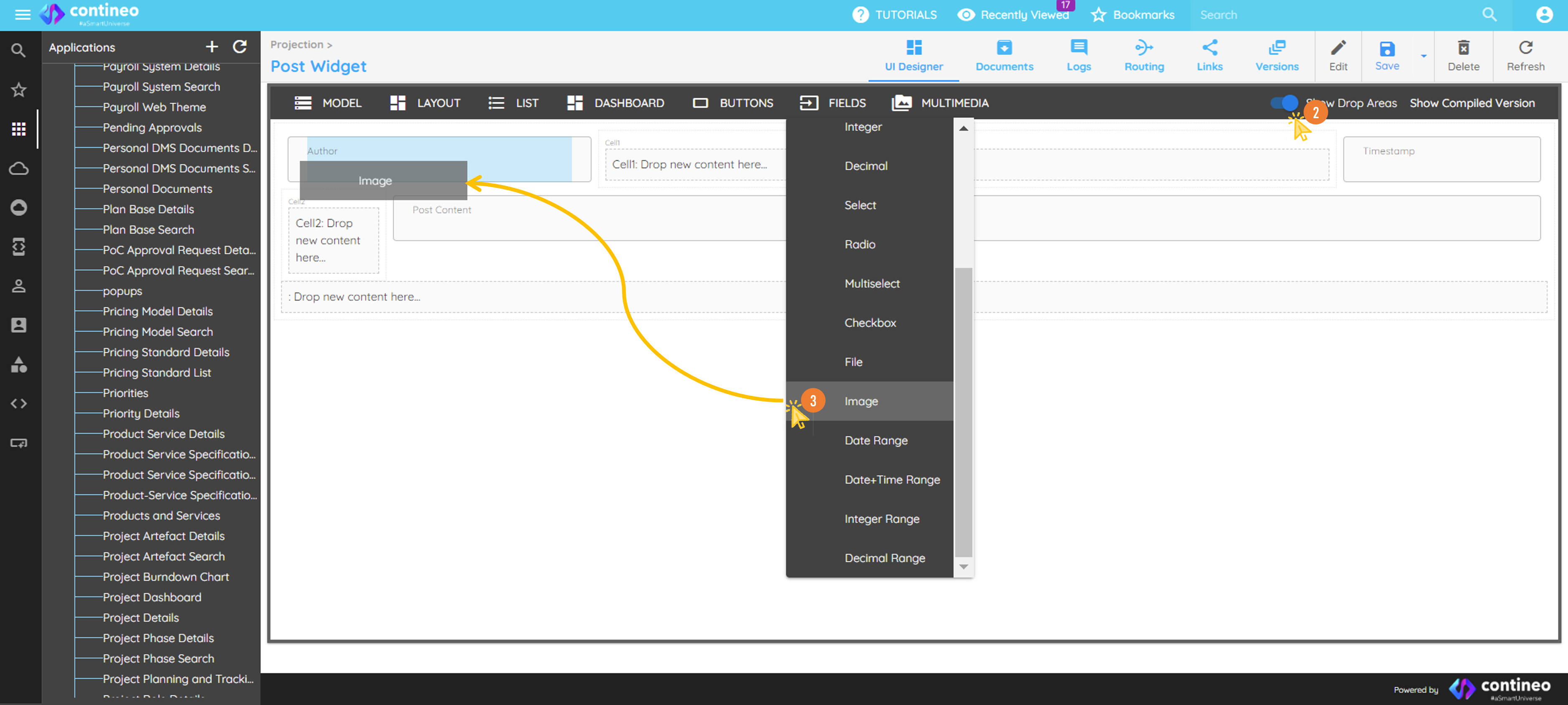
Click the Show Drop Areas slider on the top menu to make the drop area visible.
Click on FIELDS and drag the standard fields from the top menu bar as needed and name it as well as resource IDs appropriately. Ensure that the resource ID is unique within the screen. Also assign the name of the variable.
Designing the layout.
You can change the width of any component by right-clicking the component and selecting the number of columns it should occupy. A wrongly added component can be deleted using the delete icon in the pop-up that shows up after right-clicking the component.Mapping data to the widget.
The data bean path of all the components (fields) in the widget is a reference to a key inside the JSON map that is associated with the parent widget, that is, data.post in this tutorial.Click SAVE.
To add components other than the list in Fields,
Drag the Label Component.
Right-click on the label to open the Properties for the same.
Click on UI Properties, and select Control Type dropdown. You can select many other types of components from this dropdown list.
For Example, To add radio button or a checkbox in GRID on the UI:
Drag Label component from fields. Right-click on component to open Properties panel.
Click UI Properties, and select Control Type dropdown list.
Select radio button or checkbox from the dropdown list.