Chart - Including a Chart Component
Including a Chart component to display data and invite further exploration of a topic.
Static Chart
For a static chart, you must specify the Series:
Drag a Cell into the widget.
Drag List > Chart into the cell.
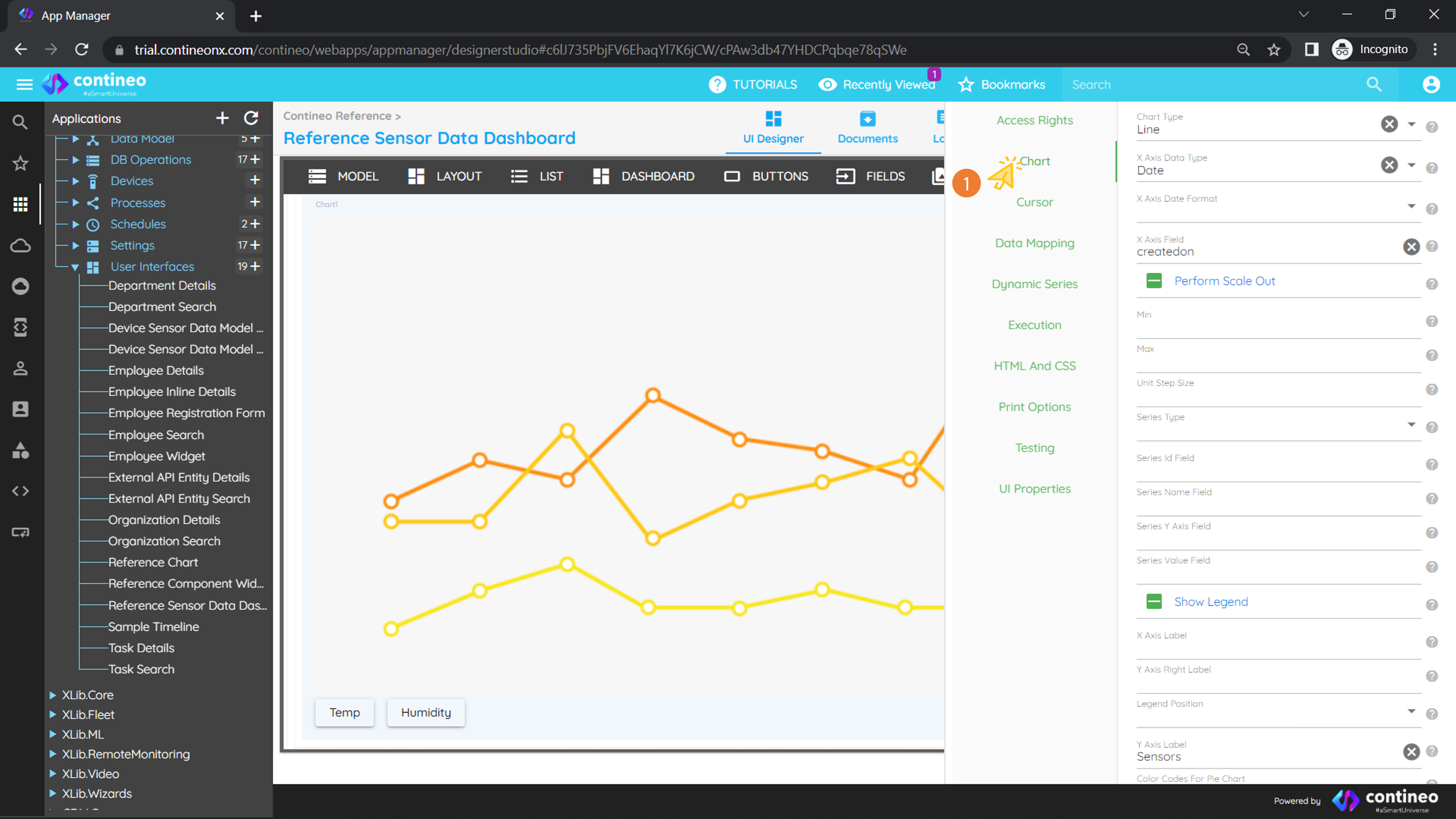
Right-click on the chart to open the Properties Panel.
Navigate to Chart > Chart and set the following properties:
X Axis Data Type = Date (depending on your data)
X Axis Field =
createdon(field name from the database query)
Drag your DB operation to UI > Model.
Navigate to Chart > Data Mapping and set:
Data Loader =
getobservations(your database operation name)Provide the DataBeanPath
Right-click on the chart and add two series for temperature and humidity readings (your parameters from the query).
Provide the Series Value Field:
temperature,humidity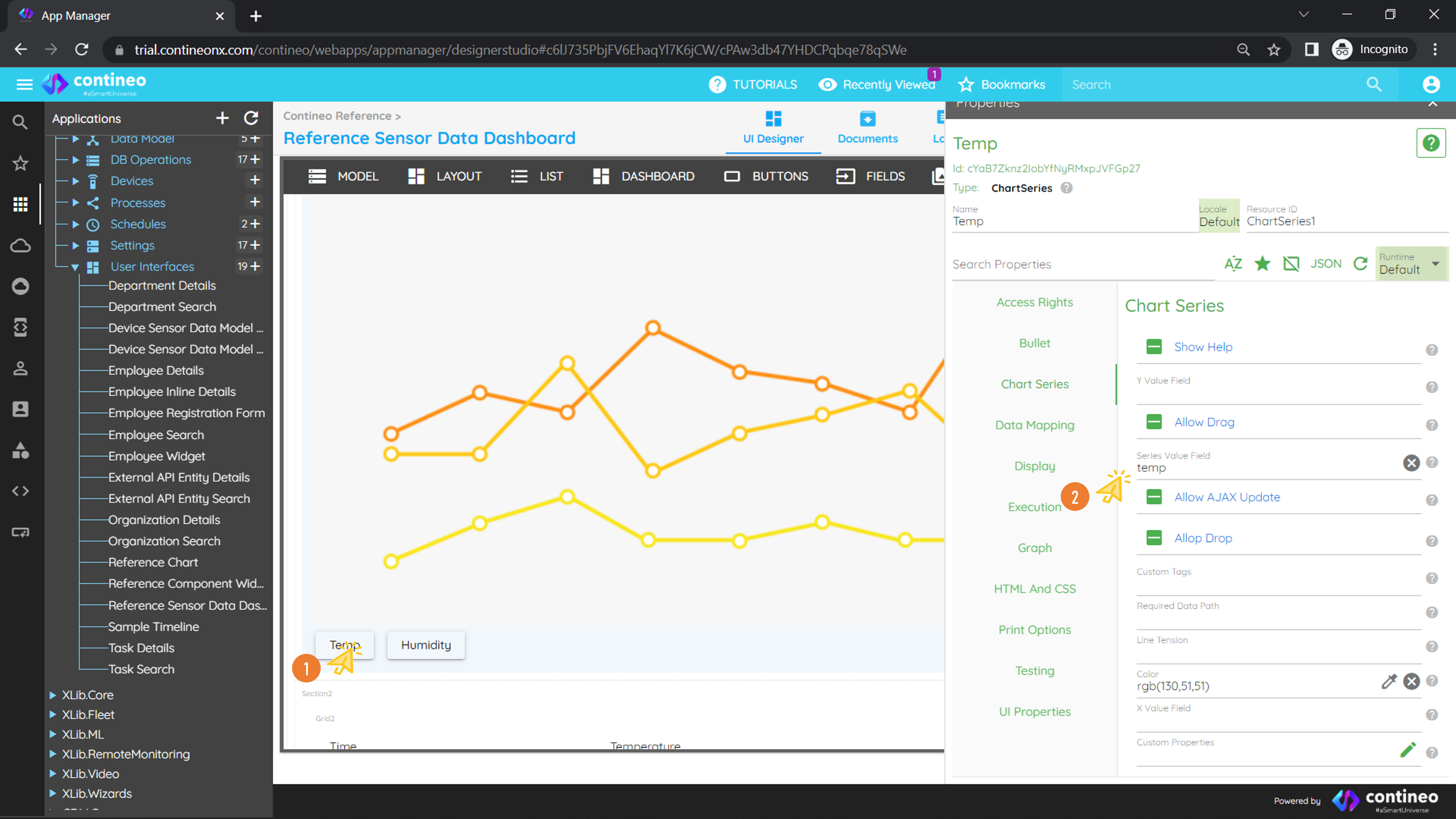
Dynamic Chart
For a dynamic chart, adding a series is not mandatory:
Drag a Cell into the widget.
Drag List > Chart into the cell.
Right-click on the chart to open the Properties Panel.
Navigate to Chart > Chart and set the following properties:
Chart Type = Line (select as per your choice)
X Axis Data Type = Text
X Axis Field =
yearSeries Type = Dynamic
Series id Field =
deptSeries Name Field =
deptSeries Y Axis Field =
revenueSeries Value Field =
revenueX Axis Label = Year
Y Axis Label = Revenue
Create a JavaScript function that returns series and drag it to UI > Model. Example:
varresult = [{ dept:"DEPT A", revenue: 15000, year: 2010 },{ dept:"DEPT A", revenue: 18000, year: 2011 },{ dept:"DEPT A", revenue: 16000, year: 2012 },{ dept:"DEPT B", revenue: 11000, year: 2010 },{ dept:"DEPT B", revenue: 14000, year: 2011 },{ dept:"DEPT B", revenue: 17000, year: 2012 }];result = utils.getObjectFromJson(JSON.stringify(result));Navigate to Chart > Data Mapping and set:
Data Loader = your JavaScript name
Provide the DataBeanPath
Save the widget and run the application.
You can also use custom chart properties using the Highcharts API:
Navigate to Chart > Data Mapping > Custom Properties and write your script. Example:
{
  'options': {
    'chart': {
      'zoomType': 'xy',
      'events': {
        click: function (e) {
          alert(
            Highcharts.dateFormat('%Y-%m-%d %H:%M:%S', e.xAxis[0].value),
            e.yAxis[0].value
          );
        }
      }
    },
    'title': {
      'text': 'Average Monthly Expenditure'
    },
    'tooltip': {
      'shared': true
    },
    'legend': {
      'layout': 'vertical',
      'align': 'left',
      'x': 120,
      'verticalAlign': 'top',
      'y': 100,
      'floating': true,
      'backgroundColor': 'rgba(255,255,255,0.25)'
    },
    'yAxis': {
      plotLines: [{
        color: 'red',
        width: 3,
        value: 20000,
        label: {
          align: 'right',
          style: { fontStyle: 'italic' },
          text: 'Custom Limit 1',
          x: -10
        },
        zIndex: 3
      }]
    }
  }
}
For more information, visit: https://www.highcharts.com/demo