Display HTML
The Display HTML component shows HTML content directly on a screen. It takes HTML from earlier components and shows it in a specific widget. This component creates rich visual interfaces such as data visualizations, interactive forms, and formatted text. This improves user experience beyond simple text exchanges.
Skill Level
No coding skill is needed for standard use, but basic HTML knowledge is recommended for troubleshooting.
How to use

Overview
The Display HTML component shows HTML content directly on the screen for the user. It receives HTML content from earlier components, specifically from the path result.text.data[0].result.html, and displays it within the selected widget.
You must set the Widget input to specify which widget shows the HTML content. This is usually a chat widget or other display area in your agent's interface.
The onComplete event starts when HTML content is successfully retrieved and shown. The onError event starts if the required HTML structure is not found in the input or cannot be shown.
When integrated with components such as Call GenAI Pipeline, Display HTML can show dynamically generated content such as data visualizations, interactive forms, and rich formatted text to enhance user experience.
Input
Name |
Code |
Type |
Description |
Data Type |
|---|---|---|---|---|
Name |
|
text |
Identifier for the session. |
string |
ResourceID |
|
text |
Unique identifier for the resource. |
string |
Widget |
|
module-selector |
Widget ID where HTML content is displayed. |
string |
Methods
Id |
Name |
Description |
Input |
Output |
|---|---|---|---|---|
|
Execute |
Adds HTML to specified widget from |
Input containing HTML content |
Sends HTML content |
Events
Id |
Name |
Description |
Arguments |
Source Methods |
|---|---|---|---|---|
onComplete |
On Complete |
Triggered when HTML content retrieval is successful. |
html, widgetId |
Execute |
onError |
On Error |
Triggered when required HTML structure not found in input. |
errorCode, message |
Execute |
Typical Chaining of Components
Source Component
Source Component |
Purpose |
Description |
|---|---|---|
|
Generate HTML Content |
Generates HTML content for Display HTML component. |
Target Component
Target Component |
Purpose |
Description |
|---|---|---|
|
Process custom events fired by the HTML |
Handles actions after HTML display. |
Implementation Example
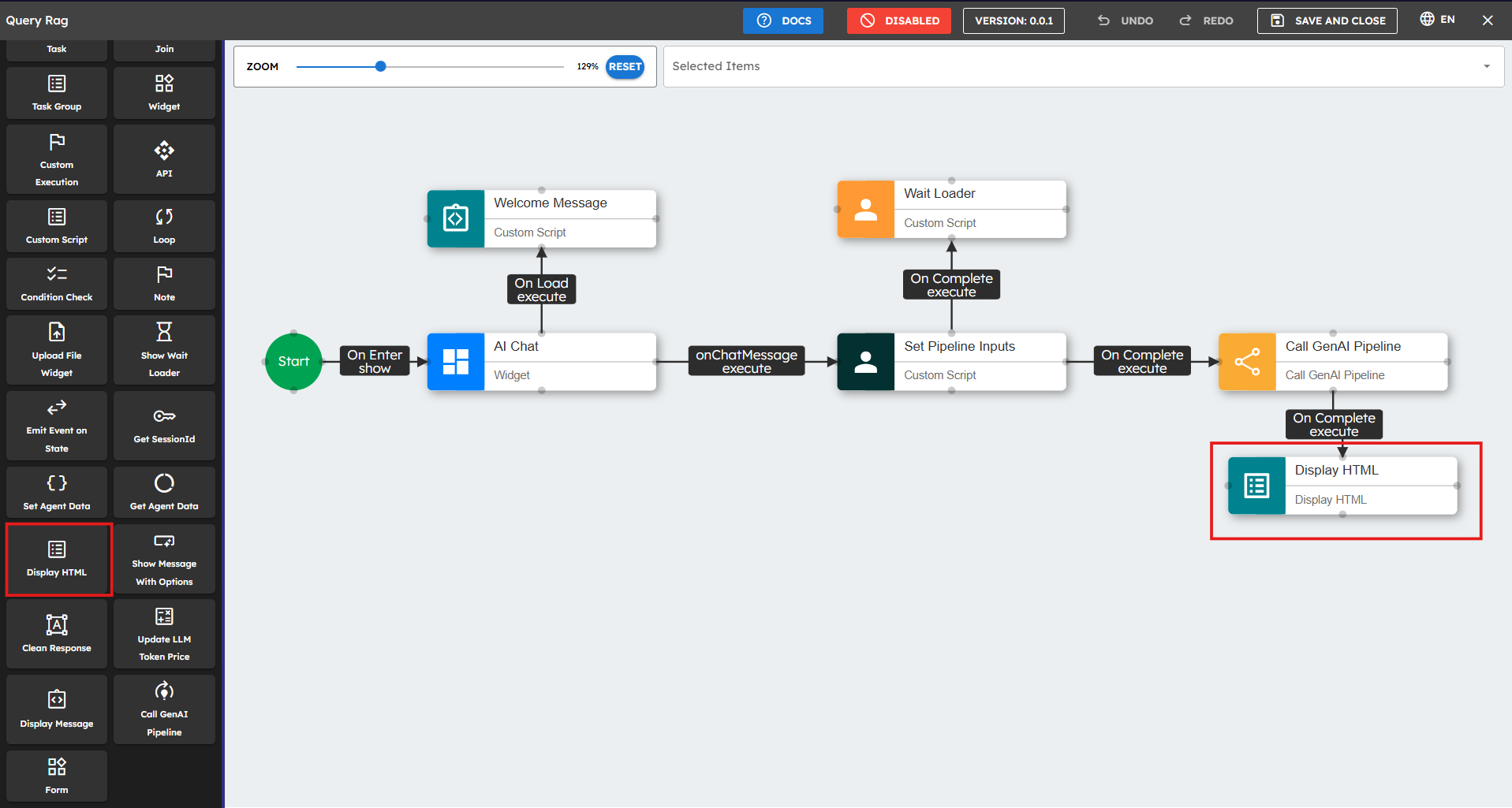
To implement the Display HTML component:
Configure Preceding Component: Ensure it returns HTML content at path
result.text.data[0].result.html.Add Display HTML Component: Drag the widget onto canvas.
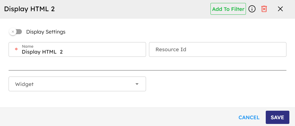
Configure the input parameters. Fields marked with * are mandatory.
Connect Components: Connect the earlier component's "onComplete" event to Display HTML's "execute" event.
Handle Errors: Connect "onError" event to error handling component.
Example Input Structure
{"result":{"text":{"data":[{"result":{"html":"Your HTML content here"}}]}}}
Best Practices
Choose the correct widget size to fit HTML content.
Check that the input structure has HTML at
result.text.data[0].result.html.Select the correct chat widget to show content.
Connect the "onError" event to give feedback when HTML does not show.
Test with different content types to make sure content shows correctly.
You can use the Custom Script component before Display HTML to verify the input structure.
Check HTML to prevent security problems.
Use responsive design principles so content works on different devices.
Common Use Cases
Use Case |
Description |
|---|---|
Data Visualization |
Charts, graphs, and data visualizations |
Interactive Forms |
User input forms with dynamic fields |
Rich Content Display |
Formatted text, images, and styled content |
Custom UI Elements |
Specialized interface components |