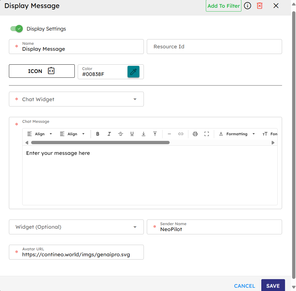
Display Message
The Display Message component sends messages in the chat widget. It requires fields such as message, sender, and avatar URL. The execute method ensures validation, gets the chat widget, sends the message, and sends onComplete when successful or onError if an issue occurs.
Skill Level
No coding knowledge is required.
How to use

Overview
The Display Message component shows static text messages in an agent's chat interface. It manages message formatting and display in the chat widget.
Input
Name |
Code |
Type |
Description |
Data Type |
|---|---|---|---|---|
Name |
|
text |
Name of the component. |
string |
Resource ID |
|
text |
Unique ID of the component. |
string |
Chat Widget |
|
dropdown |
The primary interface between user and agent. Select AI Chat - v.0.0.1 (ZLib.ContineoWorkspace) for standard chat display. If custom widgets are made public, they appear in the dropdown. |
string |
Chat Message |
|
text area |
Static text content to display in the chat interface. |
string |
Widget (Optional) |
|
dropdown |
Select the custom widget to show inside the chat window. |
string |
Sender Name |
|
text |
The name displayed as the message sender. |
string |
Avatar URL |
|
text |
URL for the sender's avatar image. |
string |
Methods
Id |
Name |
Description |
Input |
Output |
|---|---|---|---|---|
|
Execute |
Trims the static message and shows it in the chat widget. |
None |
Displays messages in the chat interface |
Events
Id |
Name |
Description |
Source Methods |
|---|---|---|---|
|
On Complete |
Triggered when the message is successfully added to the chat interface. |
Execute |
|
On Error |
Triggered when an error occurs during display (for example, missing chat component in the widget). |
Execute |
Typical Chaining of Components
Source → Display Message
Source Component |
Purpose |
Description |
|---|---|---|
|
Initial Greeting |
The |
|
Process Notification |
Any component event can trigger Display Message to show status updates. |
Display Message → Target
Target Component |
Purpose |
Description |
|---|---|---|
|
Workflow Continuation |
The |
|
Error Management |
The |
Implementation Example
To use the Display Message component:
Drag the Display Message component from the component palette to your canvas.
Set up the input parameters. Fields marked with * are required.
Connect an event (for example, the Start node's
onLoadevent) to the Display Message component'sexecutemethod.Optionally, connect the component’s
onCompleteevent to trigger next workflow steps.
⚠️ Important Limitations
Static Content Only: Only hardcoded messages are supported. Dynamic content is not allowed.
No Localization: This component does not support multiple languages.
✅ Alternative for Dynamic Content
If you need to show dynamic text content (for example, API responses), use the Process Response component instead.
Best Practices
Clear Communication: Use concise, informative messages to guide users.
Consistent Branding: Use the same sender name and avatar for all Display Message components.
Strategic Placement: Place at key moments in the flow for clarity and assistance.
Error Handling: Always connect the
onErrorevent to appropriate fallback components.Testing: Ensure messages display correctly in all expected UI contexts.
Common Use Cases
Use Case |
Description |
|---|---|
Welcome Message |
Trigger the component with Start node’s |
Error Notifications |
Show error-specific messages when other components trigger an |
Process Completion |
Confirm successful steps with a Display Message after process completion. |
Usage Instructions |
Provide contextual help during complex agent workflows. |