Show Message With Options
The Show Message with Options component lets your agent show messages with clickable buttons to users. Instead of typing answers, users can simply click one of the buttons you set up. Each button makes something different happen in your workflow.
Skill Level
No programming knowledge is required. You simply need to write your message text and set up button options using a straightforward format.
Overview
The Show Message with Options component shows a message with buttons in your chat. When the user clicks a button, it triggers an action in your workflow. Use this component when you want users to choose from specific options instead of typing text answers. It works well for yes/no questions, menus, or guided conversations.
Input
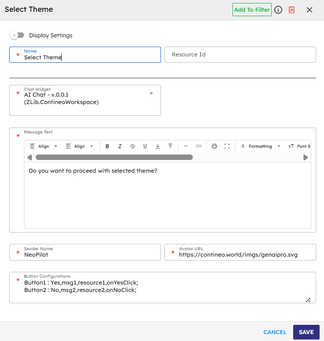
Name | Code | Type | Description | Data Type |
|---|---|---|---|---|
Name |
| text | Name of the step. | string |
Resource Id (Optional Input) |
| text | Resource ID for the step. | string |
Chat Widget |
| dropdown | The chat widget where the message appears. | module-selector |
Message Text |
| text area | The text you want to show above the buttons. | string |
Sender Name |
| text | Name that shows as the sender of the message. | string |
Avatar URL |
| text | The image that appears next to the message. | string |
Button Configurations |
| text area | Setup each button by using the following format: | string |
Methods
ID | Name | Description | Input | Output |
|---|---|---|---|---|
| Execute | Display the message with buttons in the chat | None (uses the settings you entered) | Message object with the text and button details |
Events
ID | Name | Description | Arguments | Source Methods |
|---|---|---|---|---|
onComplete | On Complete | The system triggers this event when the message and button display correctly. | name, source, result | Execute |
onError | On Error | The system triggers this event when a problem occurs while displaying the message or button. | name, source, error | Execute |
[Button Events] | Custom Button Events | Each button creates its event (For example, "onYesClick") that happens when a user clicks that button. | name, source | Execute |
Typical Chaining of Components
Source Components
Source Component | Purpose | Description |
|---|---|---|
| Show Options | Any component that needs to ask the user to make a choice. |
Target Components
Target Component | Purpose | Description |
|---|---|---|
| Handle User Choice | Different components run based on which button the user clicks. |
Implementation Example
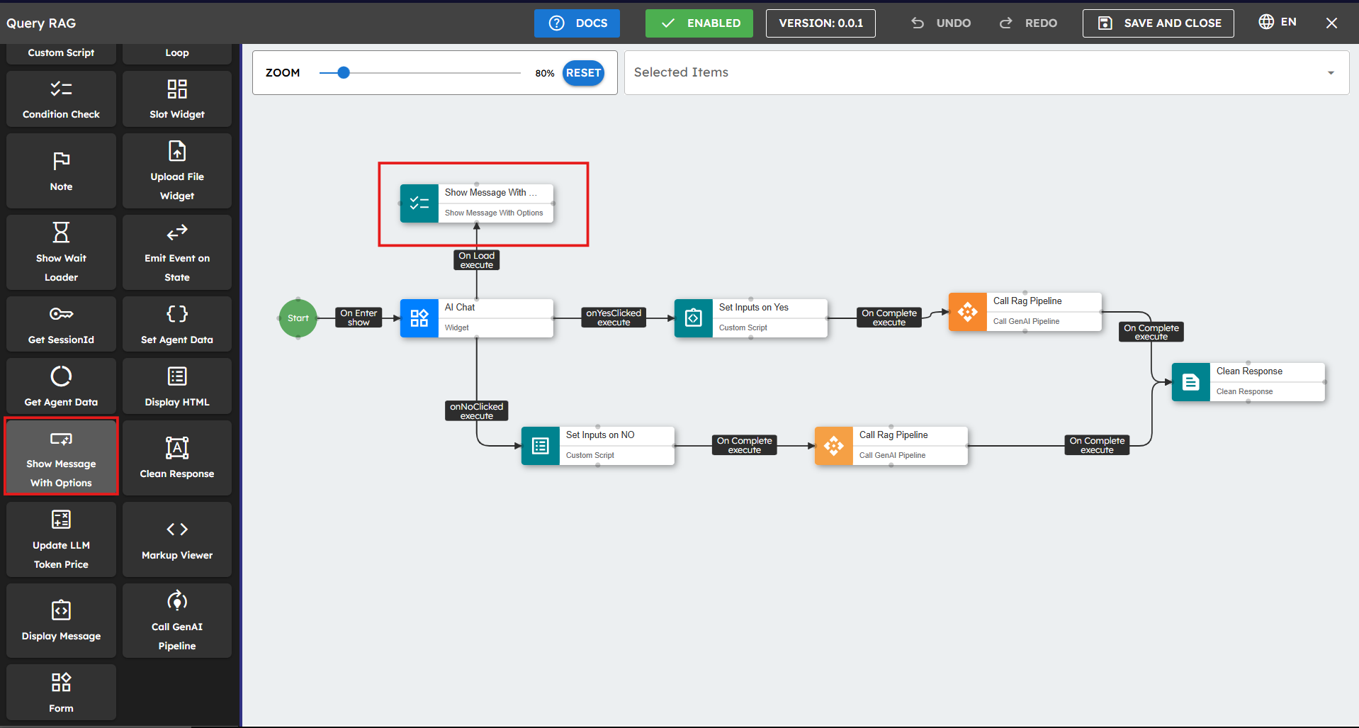
Follow these steps to implement the Show Message with Options component:
Drag the Show Message with the Options component to your canvas.
Configure the input parameters. Fields marked with
*are mandatory.Connect other components to the button events to create different paths in your workflow.
Best Practices
Keep button text short: Use 1-3 words for buttons.
Write clear messages: Make sure users understand what each button does.
Limit options: Use 2-4 buttons to avoid overwhelming users.
Handle errors: Connect something to the onError event to catch problems.
Plan your workflow: Create paths for each button choice.
Test everything: Click each button to make sure it works correctly.
Use good event names: Name your events clearly so you know what they do.
Common Use Cases
Use Case | Button Setup Example | Description |
|---|---|---|
Yes/No Question |
| Ask a simple yes/no question. |
Menu Choices |
| Give users a menu of choices. |
Confirmation |
| Ask users to confirm or cancel an action. |
Rating System |
| Let users rate something. |
Next Steps |
| Controls a step-by-step process. |