Show Wait Loader
The Show Wait Loader component shows a spinning animation in your chat interface when the system is working on something.
Skill Level
No coding skill is required.
How to use

Overview
The Show Wait Loader component displays a loading animation in your chat widget when your system needs time to process something. It shows an avatar (which can be customized with any image URL) with a spinning animation to tell users "I am working on your request" instead of leaving them wondering if the system has frozen. Use this component when operations such as API calls, data processing, or complex calculations take several seconds to complete.
Two important points to remember:
The component that follows the Show Wait Loader must be connected to the same source component as the Wait Loader itself.
The loading animation automatically disappears once the system receives a response - you do not need to manually hide it.
Place this component right before any time-consuming operation to keep users informed and prevent them from thinking something is broken.
Input
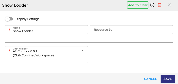
Name |
Code |
Type |
Description |
Data Type |
|---|---|---|---|---|
Name |
|
text |
Name of the step. |
string |
Resource ID (Optional Input) |
|
text |
Resource ID for the step. |
string |
Chat Widget |
|
dropdown |
The chat widget where the message appears. |
module-selector |
Methods
ID |
Name |
Description |
Input |
Output |
|---|---|---|---|---|
|
Execute |
Displays the wait loader animation in the selected chat widget. |
N/A |
Result of method execution in JSON format |
Events
ID |
Name |
Description |
Arguments |
Source Methods |
|---|---|---|---|---|
onComplete |
On Complete |
The system triggers this event when it successfully shows the wait message. |
name, source, result |
Execute |
onError |
On Error |
The system triggers this event when an error occurs during execution. |
name, source, error |
Execute |
Typical Chaining of Components
Source Component |
Purpose |
Description |
|---|---|---|
|
Trigger Wait Loader |
Activates the wait loader after the user clicks a button that starts the process. |
Implementation Example
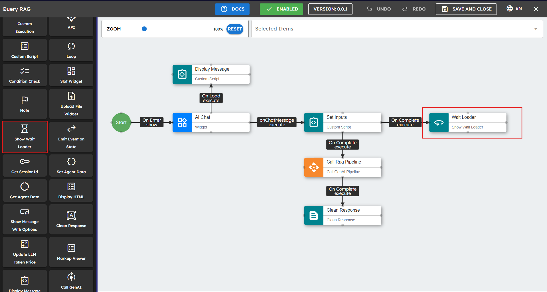
Follow these steps to implement the Show Wait Loader in your workflow:
Drag the Show Wait Loader component onto your design canvas.
Select the chat widget from the Widget dropdown menu.
Connect this component before operations that might take time to complete.
Best Practices
Use the Wait Loader before any operation that takes more than 3 seconds to complete.
Consider adding a message component after long operations to let users know the task is complete.
Common Use Cases
Use Case |
Description |
|---|---|
Before making API calls to external services |
Show the loading indicator while waiting for external API responses. |
While processing large amounts of data |
Display the wait loader during data analysis or transformation operations. |
When generating complex responses |
Indicate processing while the system generates detailed or complex responses. |
While searching databases |
Show the wait indicator during database query execution and processing. |