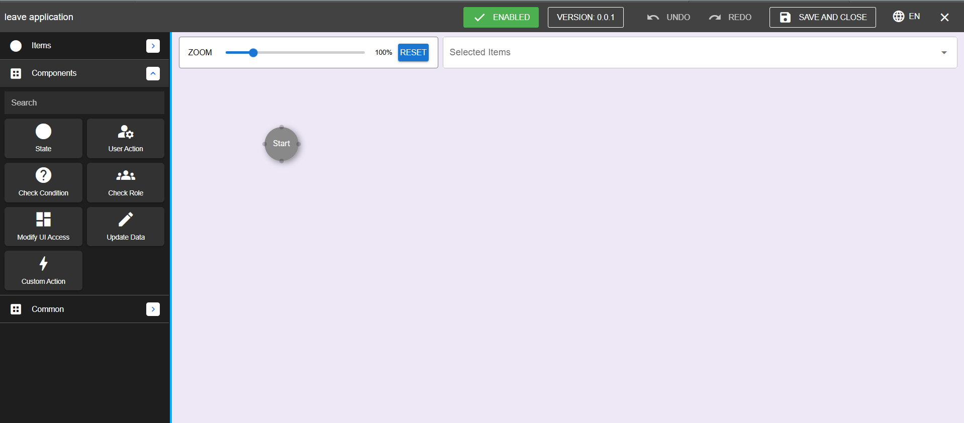
The Workflow Builder provides a set of components to construct and manage workflows. These components appear in the menu on the left side of the interface.
Components Overview
1. State
Each workflow has multiple states that represent the transition of an item through the system. States define the workflow's flow and allow forms to move between them.
Adding a State: Drag the State component to the workflow canvas.
Example: Leave Management System
Start: Leave application initiated.
Submitted: Application submitted.
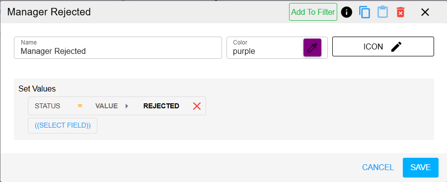
Rejected: Leave rejected.
Pending: Approval pending.
Approved: Leave approved.
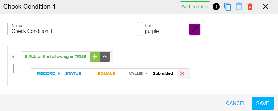
2. Check Condition
This component validates whether an item can move to the next state. It ensures that specific conditions are met before progression.
Adding a Check Condition:
Drag the component to the canvas.
Link it to a state or another component.
Double-click to add conditions (for example, "Employee's leave quota > requested leave days").
Example:
Validate that the user’s leave quota is sufficient before allowing the leave application to proceed.
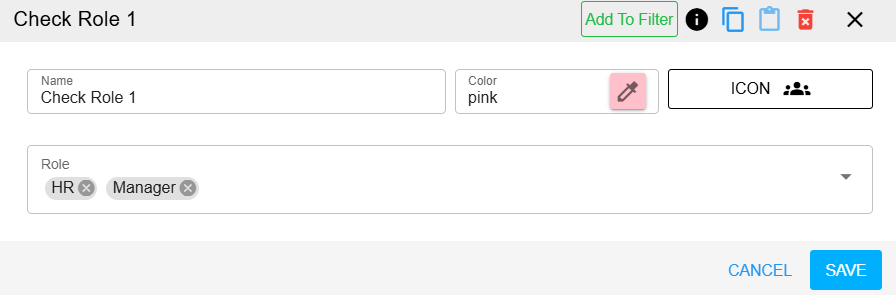
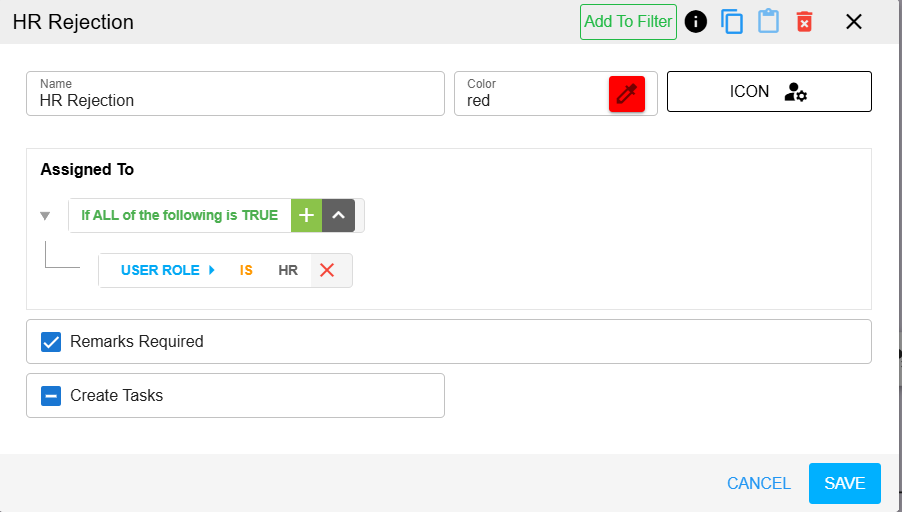
3. Check Role
This component restricts access to specific events based on user roles.
Usage: Only designated roles (for example, Manager, HR) can perform certain actions.
Adding a Check Role:
Drag the component to the canvas.
Link it to a state or condition.
Double-click to specify roles and their permissions.
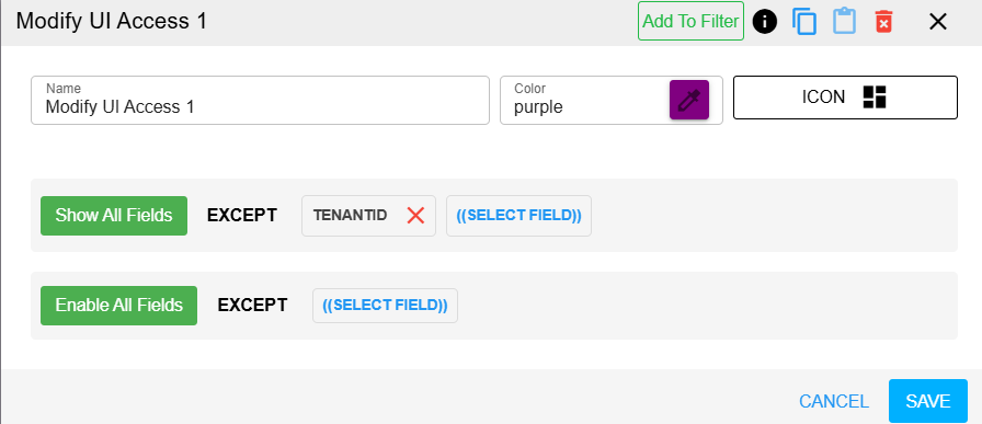
4. Modify UI Access
This component customizes the visibility and accessibility of UI elements based on roles.
Usage:
Display salary fields to HR only.
Show approval fields to Managers only.
Adding Modify UI Access:
Drag the component to the canvas.
Link it to a state or condition.
Double-click to configure field visibility (for example, "Show all fields except...").
5. Update Data
This component manages data updates within the application. It automates data changes based on workflow events.
Example:
If a leave request is approved, deduct the approved leave days from the employee's leave balance.
Adding Update Data:
Drag the component to the canvas.
Double-click to set field values and configurations.
6. Custom Action
This component handles dynamic and custom logic using JavaScript.
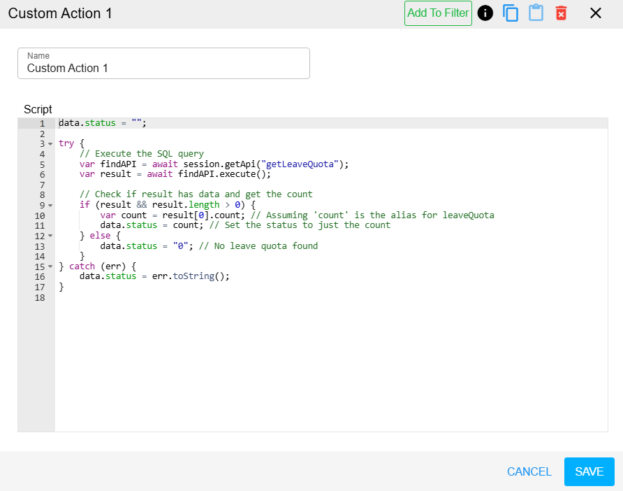
Usage:
Send an email notification upon approval or rejection.
Implement additional business logic.
Adding a Custom Action:
Drag the component to the canvas.
Double-click to write and configure JavaScript code.