Creating Custom UI Components
Learn how to create reusable custom UI components.
Creating a Custom UI Component
Creating a separate custom UI component is beneficial when:
A certain group of components appears more than once in your application
OR
The nesting depth of components within a screen becomes unmanageable.
Example:
A social media post that includes an author image, name, title, content, and attachment needs to be displayed on both the main feed and individual/group pages.
Steps:
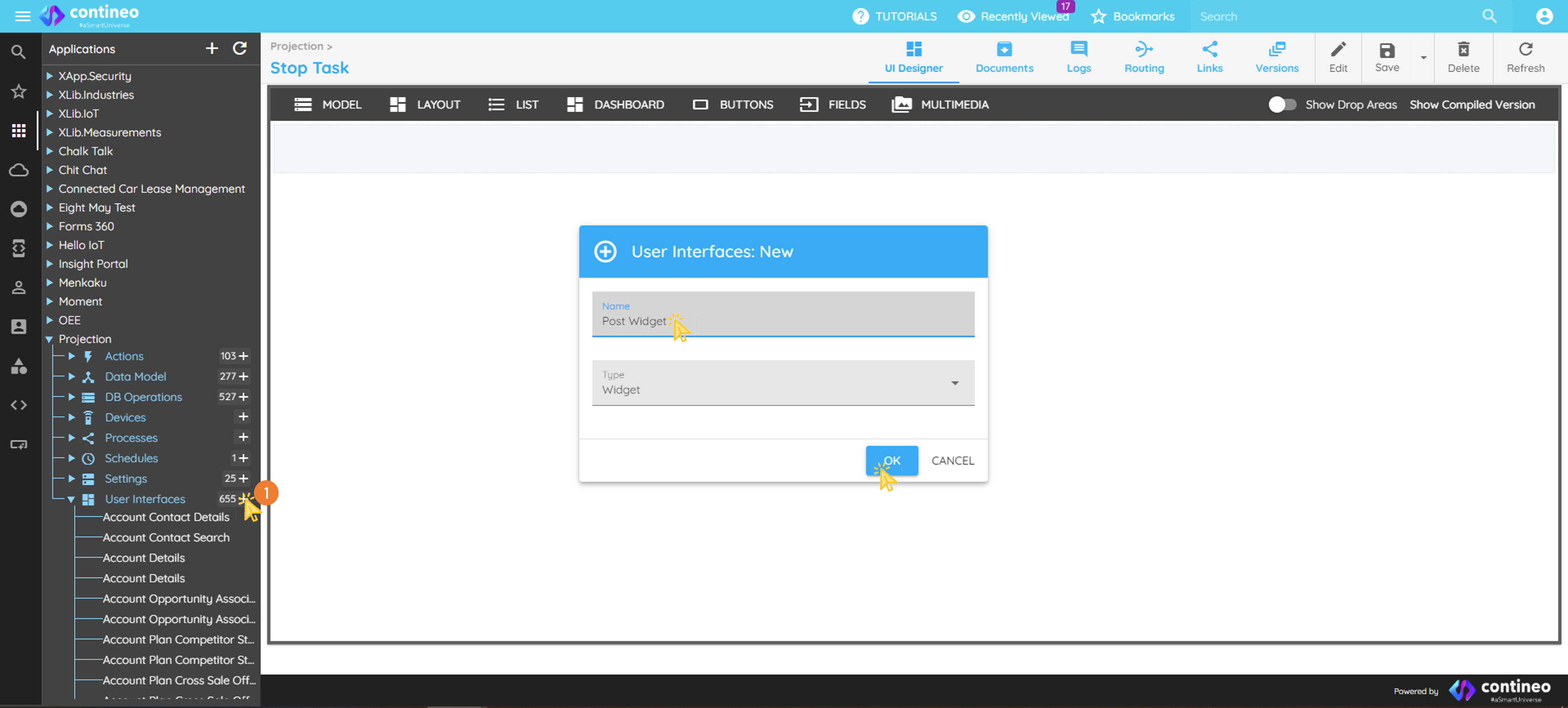
Create a new widget.
Navigate to User Interfaces under your application in the component explorer.
Click the + icon.
Specify a unique name for the new widget and click OK.
Assign a unique JSON structure name as the data bean path of the main widget. Navigate to:
Data Mapping → Data Bean Path, for example,"post". It is a good practice to initialize the data bean path to an empty JSON map:data.post = utils.createMap();
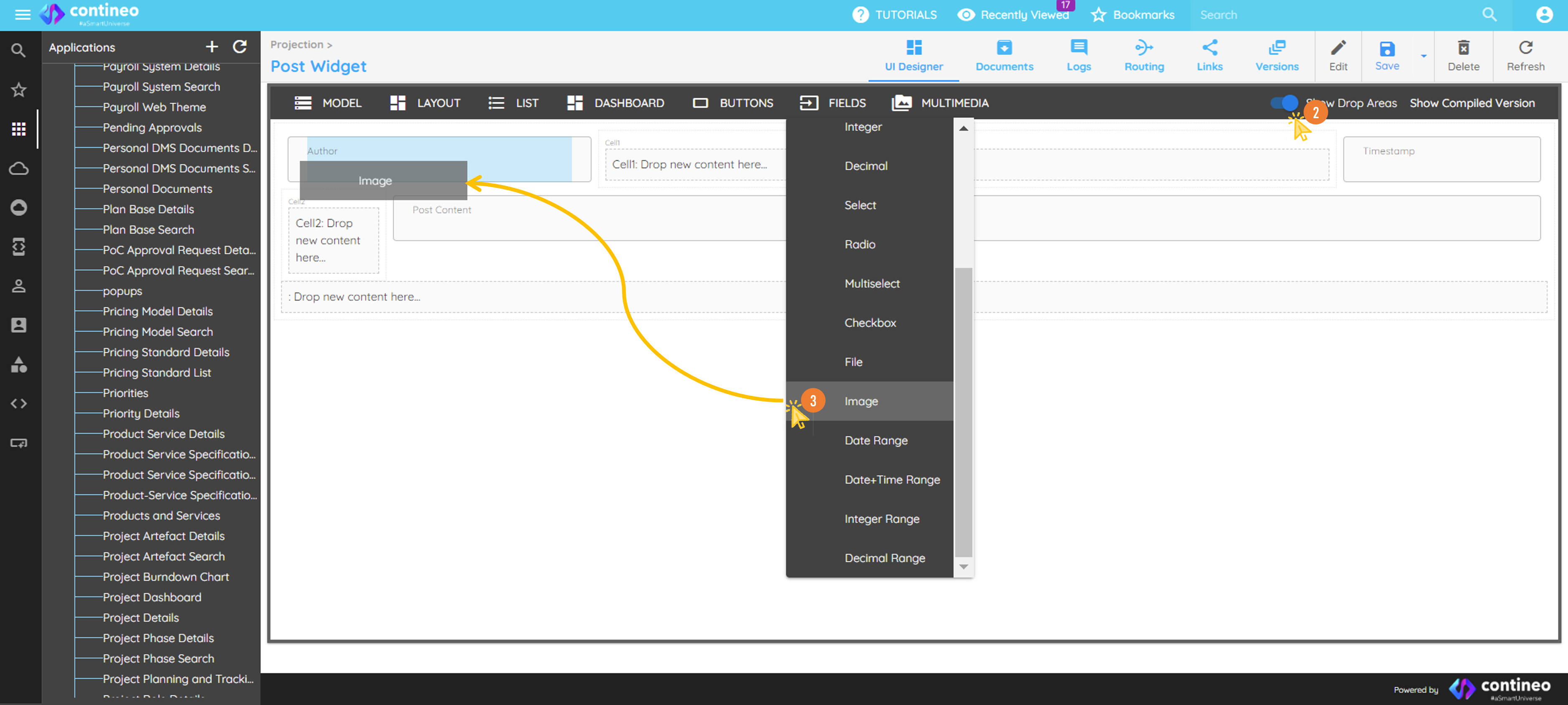
Click the Show Drop Areas slider on the top menu to make the drop area visible.
Drag standard UI components from the top menu bar.
Name the components and resource IDs appropriately.
Ensure the resource ID is unique within the screen.
Assign a variable name.
Design the layout.
Change the width of any component by right-clicking it and selecting the number of columns it should occupy.
Delete incorrectly added components using the delete icon in the popup after right-click.
Map data to the widget.
All components in the widget should use keys from the parent widget’s JSON data bean path (for example,
data.post).Custom UI components can also be placed inside a UI Repeater.
Using the custom UI component.
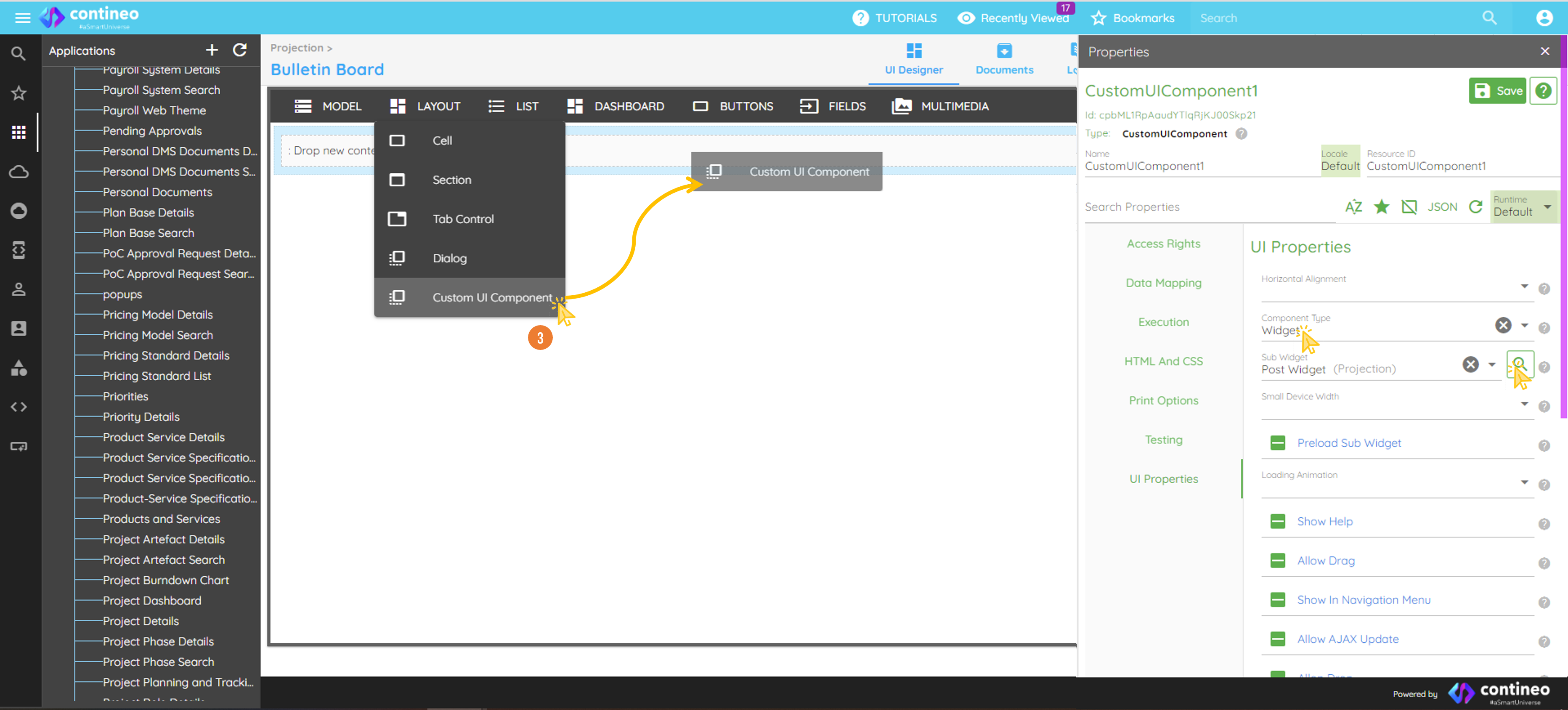
Open the target user interface.
Drag Layout > Custom UI Component to the desired location.
In the Properties panel, set Component Type as
Widget.Search and select your newly created widget.
Data Mapping:
For more info about defining data paths and mapping data, refer to the Simple path and inherited path guide.